
| COIN MAP - UX DESIGN
According to Forbes,
44% of people say the main reason they don't buy cryptocurrency is due to a lack of knowledge and available education on it.
What if we could close that gap while making learning about crypto assets a more visual experience?
THE CLIENT
While many apps and websites exist for the buy, sell, track and trade of cryptocurrencies, few are accessibly educational to newer or less experienced crypto investors. Even for experienced crypto buyers, Coin Map is still a way to deepen their knowledge. But for newbies, most sites that do contain information and/or news sources often require a basic level of understanding. Coin Map is an innovative design and content beginner-friendly platform for learning about crypto assets.
OPPORTUNITY
To create an explorative visual interface that can be used to track and browse coins, as well as offer guidance on relevant crypto terminology and a fresh way to compare them.
TOOLS
Figma & InVision
MY ROLE
UX/UI
TIMELINE
Three week sprint
TASKSDomain research, competitive/comparative analysis, public survey, interviews, user research, feature finalization, contextual inquiry on existing design, user flow, lo-fi prototypes, visual research, usability testing, mid-fi wireframes, interface design, high fidelity mock ups

S1-
Research
My team and I learned from Grandview Research that the global blockchain market size is expected to reach $27 million by 2025.
Alt Coin Magazine noted that at the end of the first half of 2019 alone, the number of blockchain wallet users reached over $40 million.
We reach out to users that fit the criteria we’re looking for. Our participants include a decade-long crypto buyer who identifies as someone with advanced knowledge on the matter; a very recent beginner investor; the CTO and UX designer of a company that uses blockchain technology; as well as a financial analyst. We ask them where they go to learn about crypto, as well as what features are important to them (or lacking) in the existing sources they use.

We learn that users turn to various social media sources for learning about crypto, which gives us some direction on what to look for and how these sources may prove to be effective educators. We also learn that amongst a broad list of features presented in our survey, visual charts, a watch list for tracking coins, and detailed coin descriptions all stand out as the top 3 most important in a good crypto service. In our research we also included a visual survey portion to get an idea of what type of interfaces our users may be most drawn to.
[ USER RESEARCH HIGHLIGHTS ]
How do people learn about crypto?

Chartguys (YouTube) for technical analysis or Andreas Antonopolous. (Twitter, website, books) for overall
Telegram groups, paid groups on Facebook (Nuggets Crypto Community) respected traders on Twitter (@CryptoHustle @filbfilb)
What do people want most?
DETAILED INFO73%
VISUAL
CHARTS
69%
TRACK COINS42%

S2 -
Planning
*Tongue in cheek* When Landon’s not driving his Tesla or bouldering at his local gym, he loves diving into crypto. But he’s still new and there’s much to learn. He is only invested in one coin, and only because a friend suggested it to him; he doesn’t have too much knowledge yet himself. His motivation is to keep track of coins he’s investing in as well as learn about other ones in a more dynamic way. His pain points are not being super familiar with the terminology, and being more of a visual learner, he craves more imagery. Overall his goal is to invest in crypto in a smart and well-informed way.
We map out Landon’s journey using prior mock-ups and tested them with our users. In this we identified ways to resolve our persona’s struggles by including features such as a glossary, onboarding, as well as cleaning up the information hierarchy and overall layout of the design.

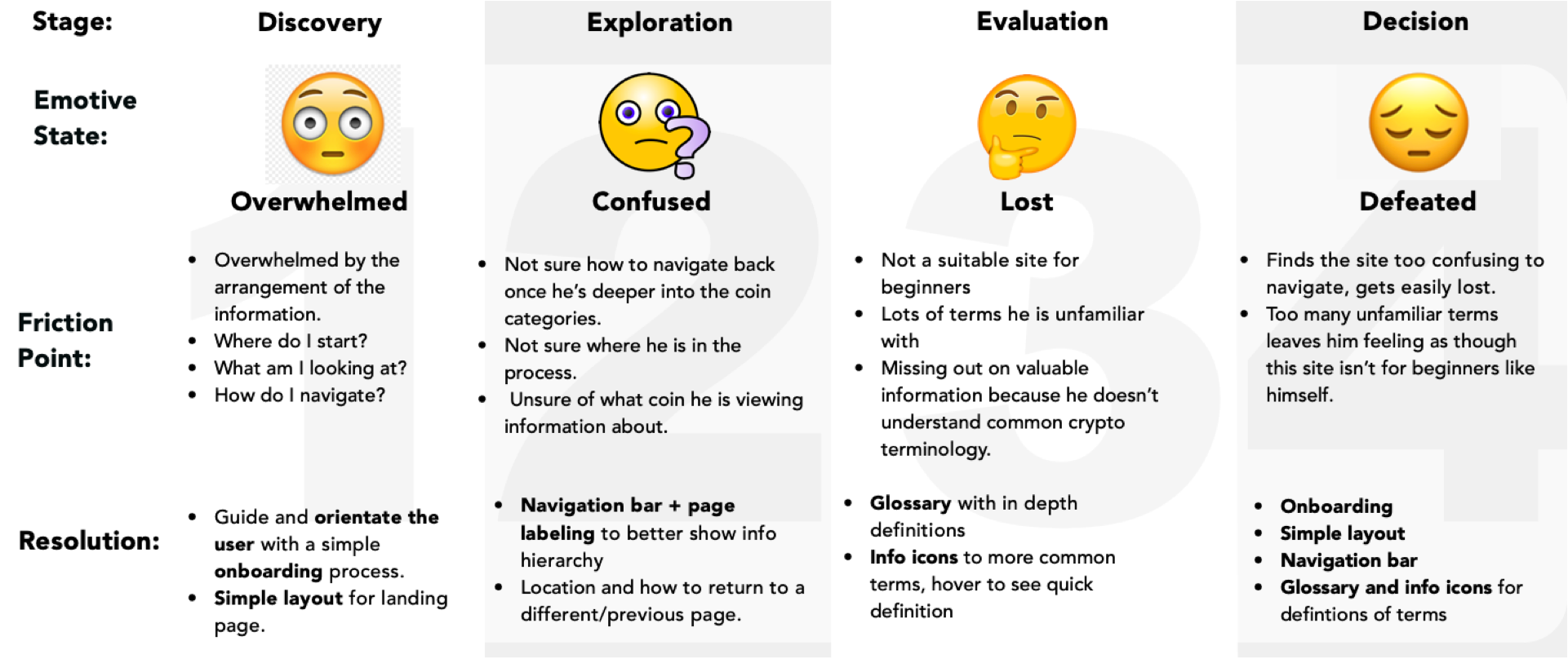

The process - A/B testing for each task at both the low fidelity (paper prototype) and mid fidelity (wireframe) level
Findings - For the interactive map flow testing, colour-coded categorization was clear, but navigating the map was still confusing. Users were getting nested in the map with no easy way out other than manual zoom.
Integration - The inclusion of side-tab navigation bar to aid with navigation without map or zoom reliance. This also provides a clear recent history of the journey they followed to get there.
S3 -
Design & Test

Can I easily navigate to previous selections without getting nested or having to zoom out or hit back a bunch of times?
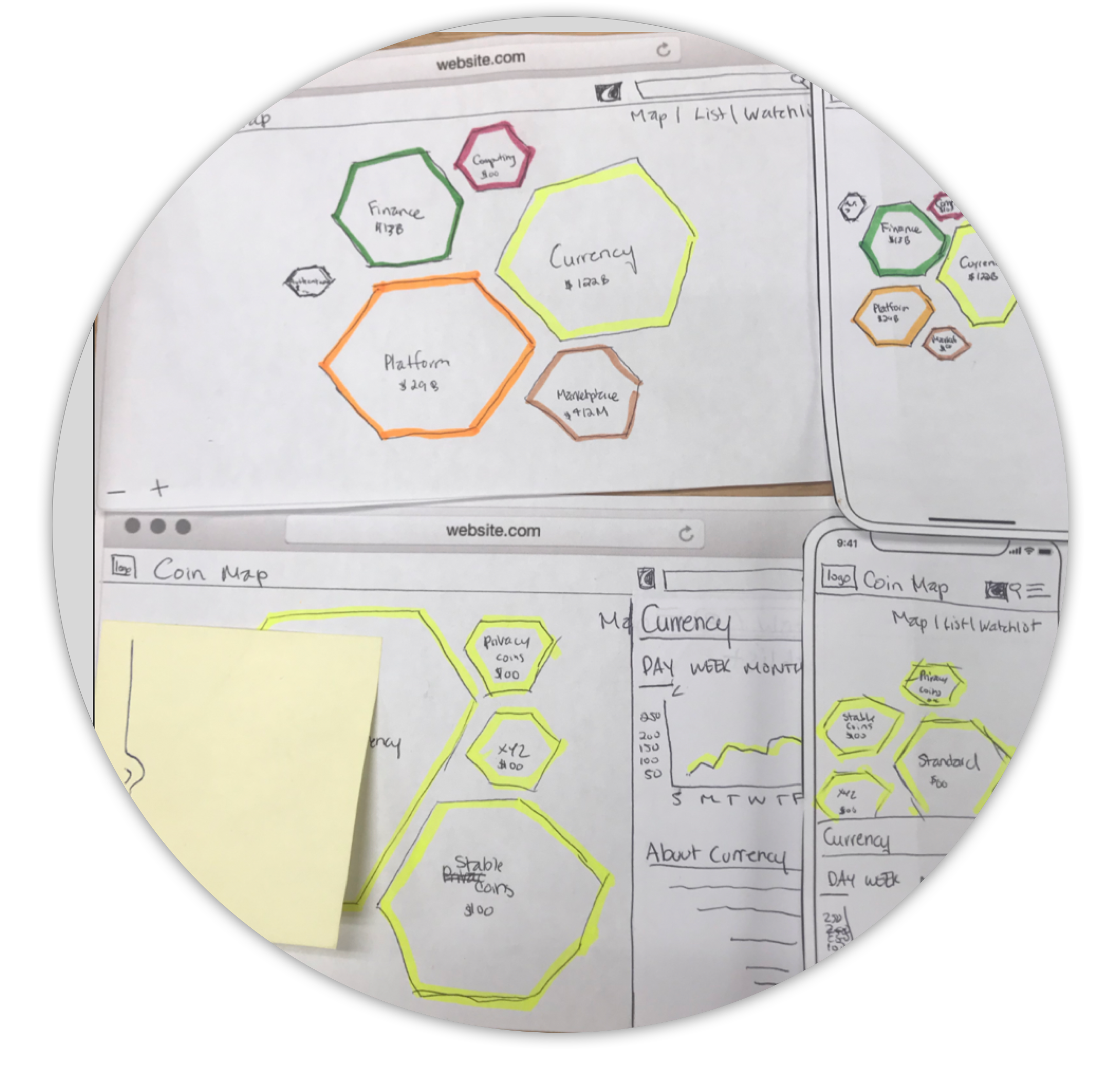

I can tell that the colours must be a
family of coins.
