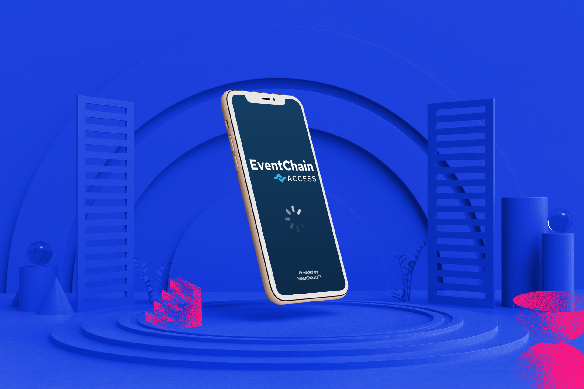
| EVENTCHAIN ACESS - UI DESIGN
What makes Event Chain — an online ticketing company for a wide range of events ranging from business, tech, to music —
different from its main competitors?
THE CLIENT
Event Chain is an online ticketing company that uses blockchain as fortified security against fraudulent tickets. Now, they’re ready to expand their service.
OPPORTUNITY
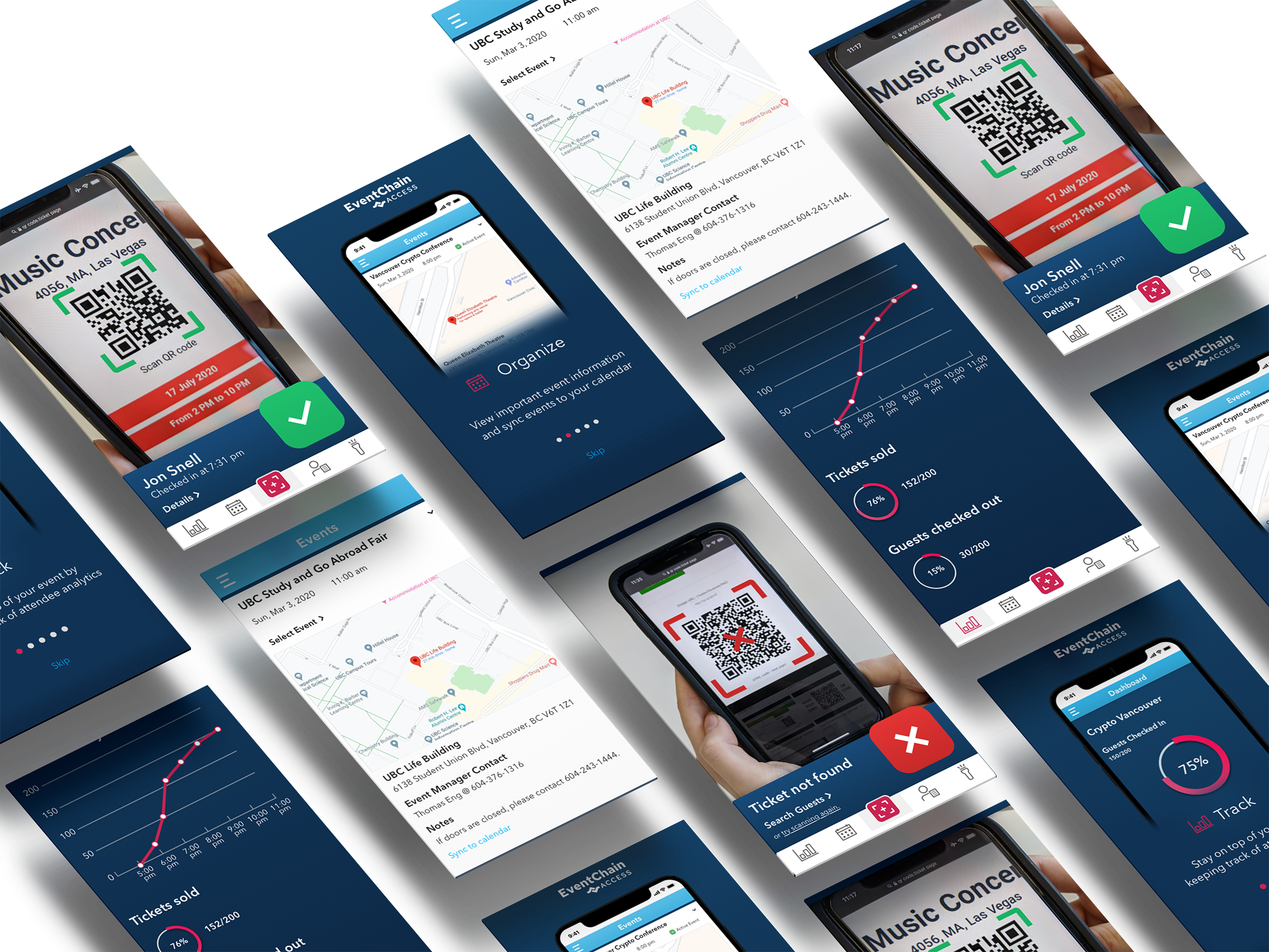
Create an affiliated app with EventChain that is targeted towards gatekeepers at events. The main function is to scan attendee’s tickets upon entry. This has to be made with an easy to understand interface.
TOOLS
Figma, Photoshop, Illustrator, InVision
MY ROLE
UI Designer
TIMELINE
Three week sprint
TASKSClient gut test, two style directions, moodboards, custom iconography, logo design, typeface pairing, shared library master, high fidelity prototype


Style directions
Mood
Safe and secure, but also playful and relaxed. Highlighting the “event” in Event Chain.
Colours
Corporate navy would contain splashes of raspberry pop to liven the blue, but also help with accessibility in creating more contrast. The use of a light sky-blue also helps spring forth a more joyous and expansive touch.
Shape
Oversized & obvious.
Voice
Reliable and efficient. Maybe even fun.. like a soda pop flavour you’ve longed to try.

Mood
With more emphasis on the “chain” in Event Chain. The mood of this direction is very cool, both literally with the entirely cool-toned palette, and figuratively with the futuristic, digital, sleek and modern aesthetic. It is professional, but in a ‘Matrix’ sort of way. Safe, in a ‘bodyguard’ way.
Very Echo Dot home AI vibe.
Alexa, tell me about the movie “Ex Machina”.
Colours
The entirely cool-toned palette would have a light gradient in order to create some depth.
Shape
Rounded, smooth, neumorphic — using shadows to create a sense of realistic 3D buttons, and a light glow around slim and wiry iconography to imitate real electronics.
Voice
Trust, transparency, boldness, elegance, cool guy.