
| GEEK GIFT REGISTRY - UX DESIGN
How can we make a one-stop price comparison portal to curate your own wish lists for geeky collectibles?
THE CLIENT
Geek Gift Registry is a niche price-comparison shopping portal for geeky pop culture collectibles, affiliated with multiple e-commerce platforms. The client himself is a back end developer.
OPPORTUNITY
Create a one-stop wish list website and shopping portal for a vast range of pop culture collectibles ranging from action figures to apparel, across various TV, Film & Video Game themes.
TOOLS
Figma, Photoshop, Illustrator, InVision
MY ROLE
UX Design Lead
TIMELINE
Three week sprint
TASKSDomain research, comparative & competitive analysis, user research, survey writing, interviews, persona identification, feature finalization, A/B testing, customer journey map, storyboarding, paper prototypes, component library master, mid fi wireframes, high fidelity mockups, project management, scrum master

S1 - Research
The collectible industry is a $12 billion dollar industry in North America alone. In Walmart, for example, collectibles are growing faster than other products and with a decent 30% profit margin. Microsoft is partnering with FONKO, a large collectibles manufacturing company with $700 million in sales every year.
Streaming services and social media generate hype and help reach larger audiences, influencing the growth of the collectibles market at a faster rate than ever. Within the market, video game collectibles in particular seem to have the highest growth.
Let’s engage in user research and see what edge GGR could have amongst its competitors.

[ SURVEY HIGHLIGHTS ]
What products and themes do people collect the most?
46%
56%
51%
1
DEALS

PRICE COMPARE2
3
HIGH RES PHOTOS4
Action FiguresStatues45%
TOYS50%
74%
What features do people seek the most?
CategoriesUPDATED STOCK5
Where are they buying from?
72%

80%

27%

S2 -
Planning
After collecting psychographic & demographic data from our user research, we grouped the data into an affinity diagram to determine the patterns and weave our persona. We noted that the most popular age range of collectors was between 20–30 years old. So our 26-year-old persona, Jason Pierce, comes to life. From our data, we learn that he needs to be able to compare prices of collectibles online, find good deals, and make a wish list so friends & family know what to get him. He wants to keep building his collection in a way this is fun, smart & engaging. J
We identify Jason’s pain points on a journey map and are now able to start narrowing down our features, moving onto the next stage of planning where we determine what is critical for this MVP, and what could be a future consideration.


User Flow
The end to end mapping comes next. What decisions could Jason make while navigating the portal?


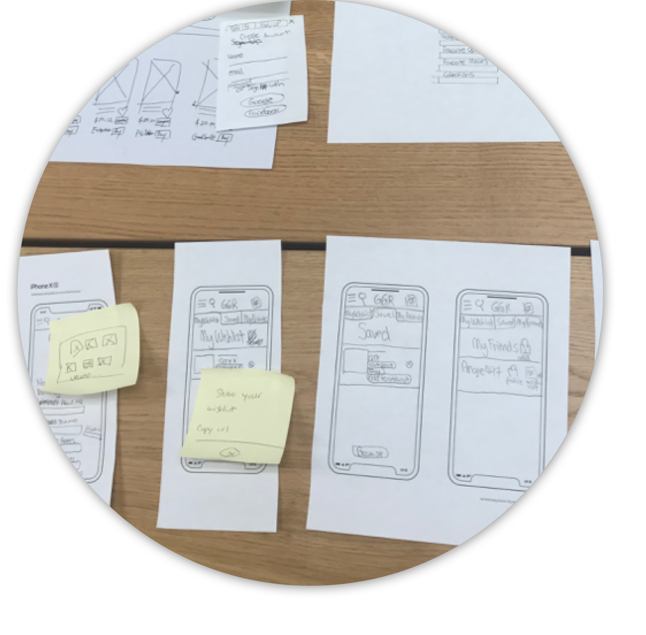
The process - Initial A/B testing for each separate journey (search filter flow, wish list flow, account set-up flow etc.) for laser focused feedback before combining all flows together in a final round of testing. Testing done at both the early stage low fi (paper prototype) and mid stage (wireframe) level, to make sure nothing was missed.
Findings - Dashboard can include more functions, sharing wish list function could be clearer, and people were unsure what the required fields are in some forms. Our main features, the comprehensive search filter and price comparison chart, were streamline and clear. Many people don’t like the idea of too many required fields in their profile either.
Integration - Simplify and reduce our required fields in the profile, so users only need to list their name/username. If they wanted to fill in any of the other categories, such as favourite movies, hobbies, collections etc, they may do so optionally. As additional state screens were also needed, rather than try and create extra community board screens in our short time-frame (nice to have), we shifted our focus on delivering a really solid MVP with our must-haves as polished as possible.
S3 -
Design & Test

No browse button needed, since dashboard is on every page

No birth year needed on profile
Prototype
